Sun Dec 15 2024
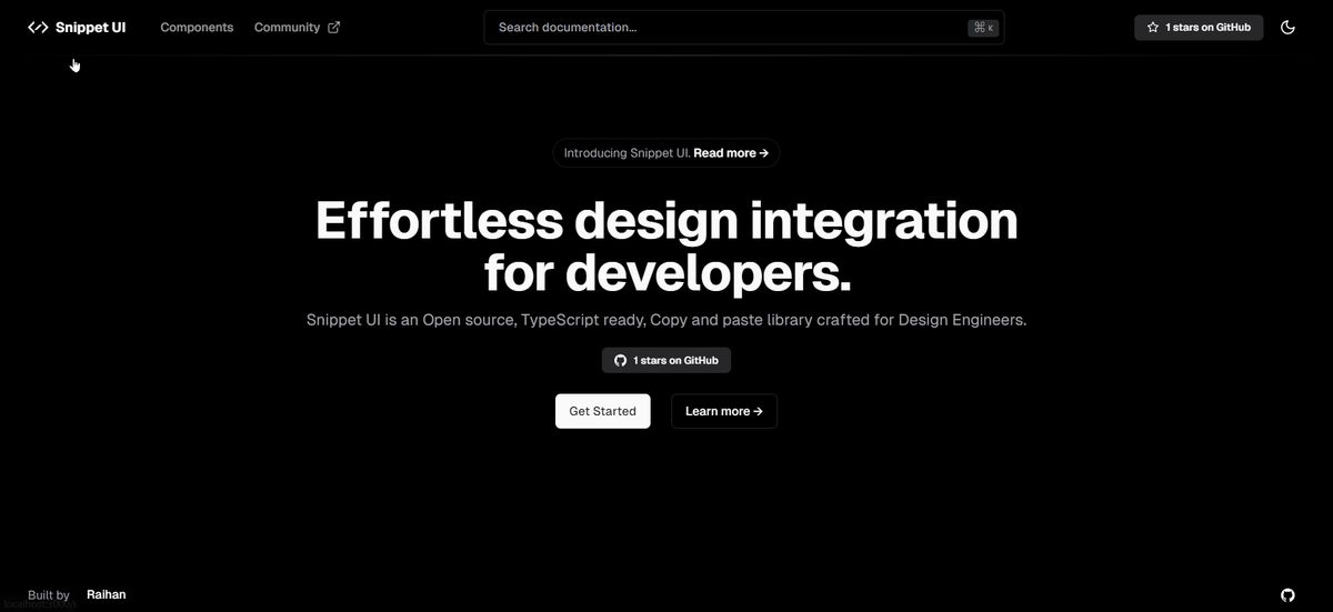
Snippet UI
React
Next.js
TypeScript
Tailwind CSS
UI Components
A collection of ready-to-use UI components built with React and Tailwind CSS, inspired by modern design patterns and best practices.
Snippet UI is a modern UI component library that provides beautifully crafted, accessible, and customizable React components. Built with Tailwind CSS, it offers a collection of reusable components to accelerate your web development process.
Backstory
Building consistent and accessible UI components from scratch can be time-consuming. Snippet UI was created to provide developers with a collection of pre-built, customizable components that follow modern design patterns and accessibility standards. Inspired by libraries like shadcn/ui, it aims to streamline the development process while maintaining flexibility and performance.
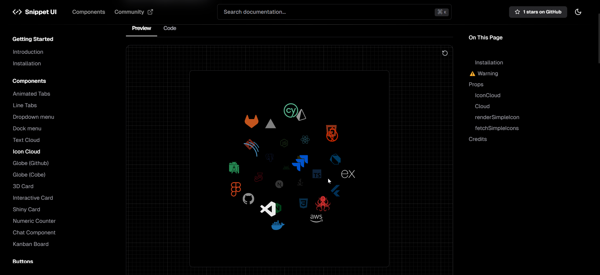
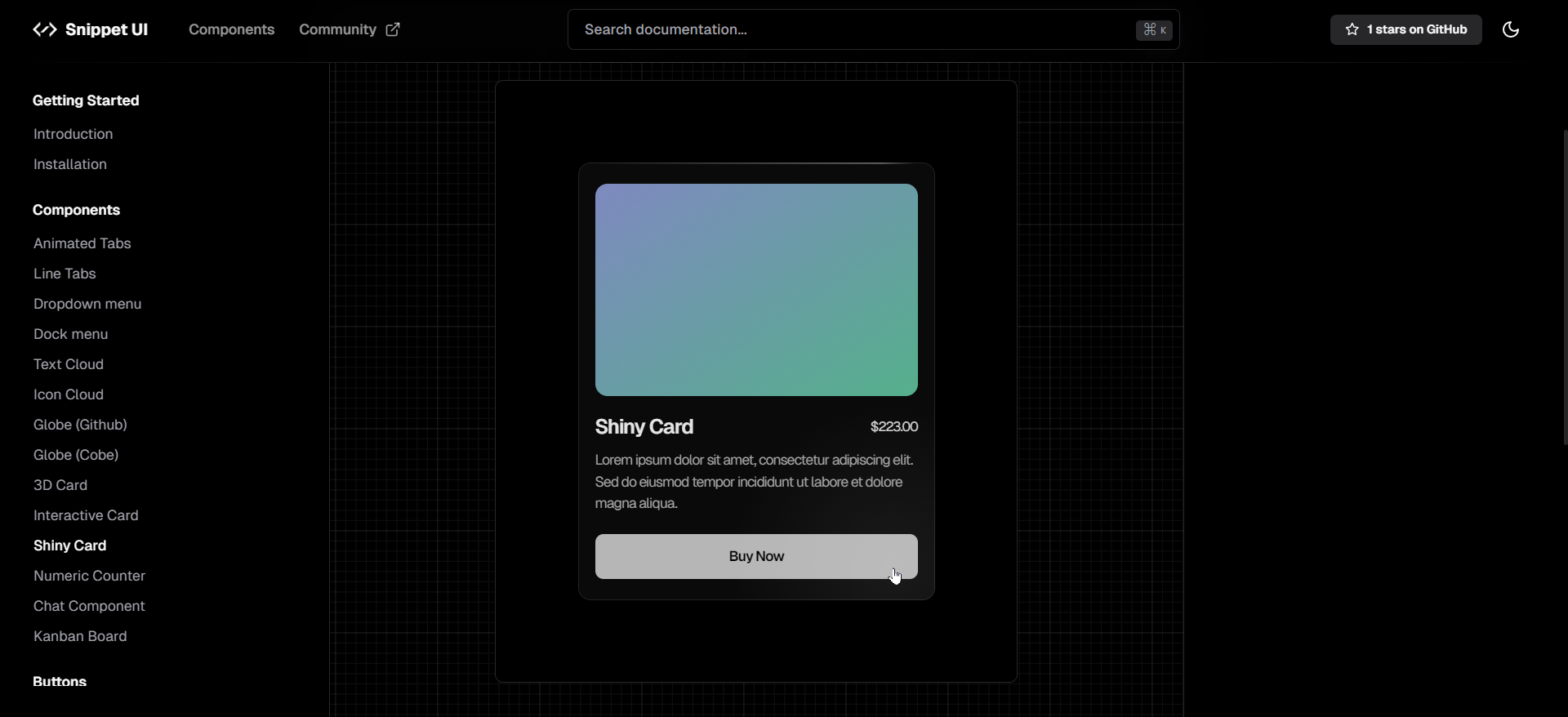
Here's a preview of our components:
Features
- Ready-to-use Components: A comprehensive collection of UI components including buttons, forms, modals, and more.
- Tailwind CSS Based: Fully customizable with Tailwind CSS utility classes.
- Accessibility First: Built with ARIA attributes and keyboard navigation in mind.
- TypeScript Support: Full TypeScript support for better development experience.
- Dark Mode Ready: Seamless dark mode implementation for all components.
Tech Stack
- Framework: React, Next.js
- Styling: Tailwind CSS
- Type Safety: TypeScript
- Animation: Framer Motion
- Accessibility: RadixUI primitives
Conclusion
Snippet UI provides developers with a solid foundation of UI components to build modern web applications faster. With its focus on customization, accessibility, and developer experience, it helps teams maintain consistency while reducing development time.
Check out Snippet UI to explore our component library!
If you have any questions or feedback, feel free to connect with me on X (formerly Twitter).